


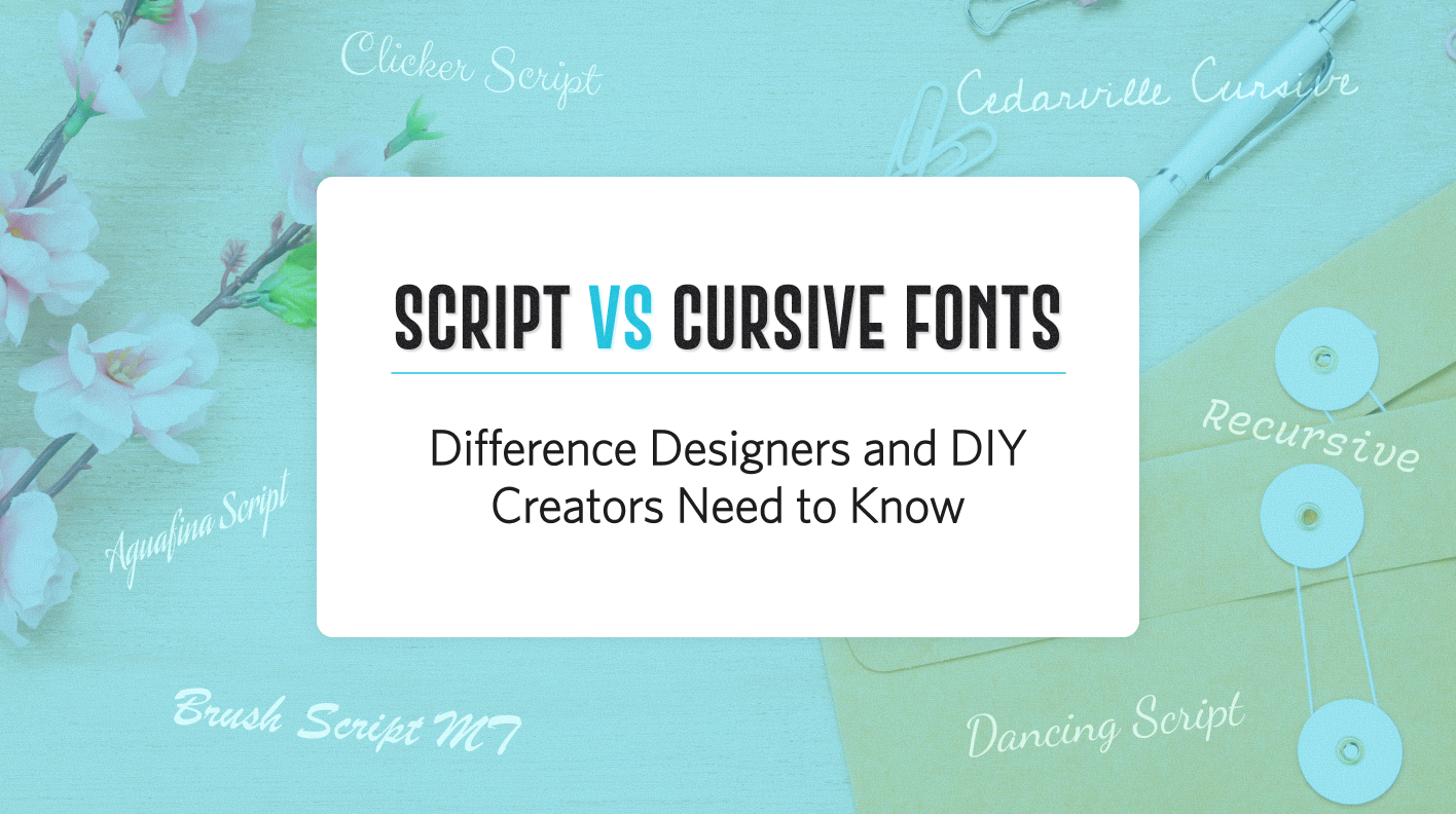
Have you ever looked at a quote on a mug, a handmade sign in someone’s entryway, or a social media graphic that instantly caught your eye? Not just because of the message, but because of how it looked? That kind of emotional connection often comes from the front. Specifically, a script font.
Fonts aren’t just letters. They set a mood. They shape how your audience feels before the message is even fully read. Fonts do more than just show the words; they also create an opinion in the eye of the beholder on how to approach and feel the design task. Script and cursive fonts add that human touch to your DIY projects or designs.
Script and cursive fonts look similar, but they are not the same. Each one has its own style and function. By knowing the differences, you can make better design choices.
This blog will teach you how these fonts differ, how to use them effectively, and why script fonts are a must-have for anyone who wants their designs to make a powerful, creative statement.
What Exactly Is a Script Font?
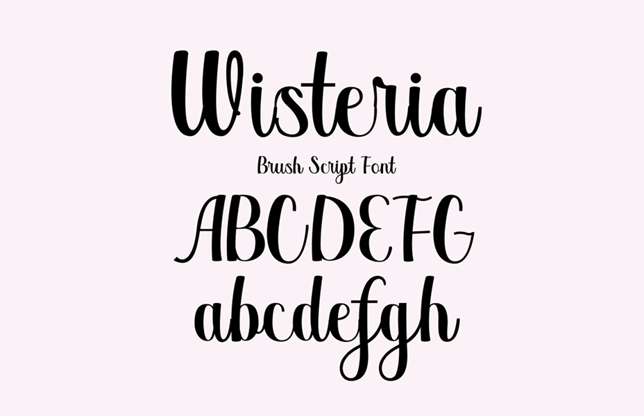
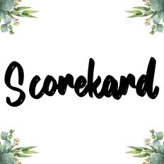
Script fonts are fonts that imitate actual handwriting but with a style. Consider it the best handwriting ever. It is sometimes fancy; other times, it is quirky, but always full of character.
Sometimes these fonts have joined letters; sometimes they don't.
Some script fonts feature connected letters, while others don’t. Some are clean and simple, while others have decorative swashes or brush-like textures. That range of styles makes script fonts so flexible for creative projects.
You’ll see script fonts used in:
- Wedding invitations
- Product packaging
- Branding and logos
- Wall art
- Personalized gifts
- Social media graphics
What About Cursive Fonts?
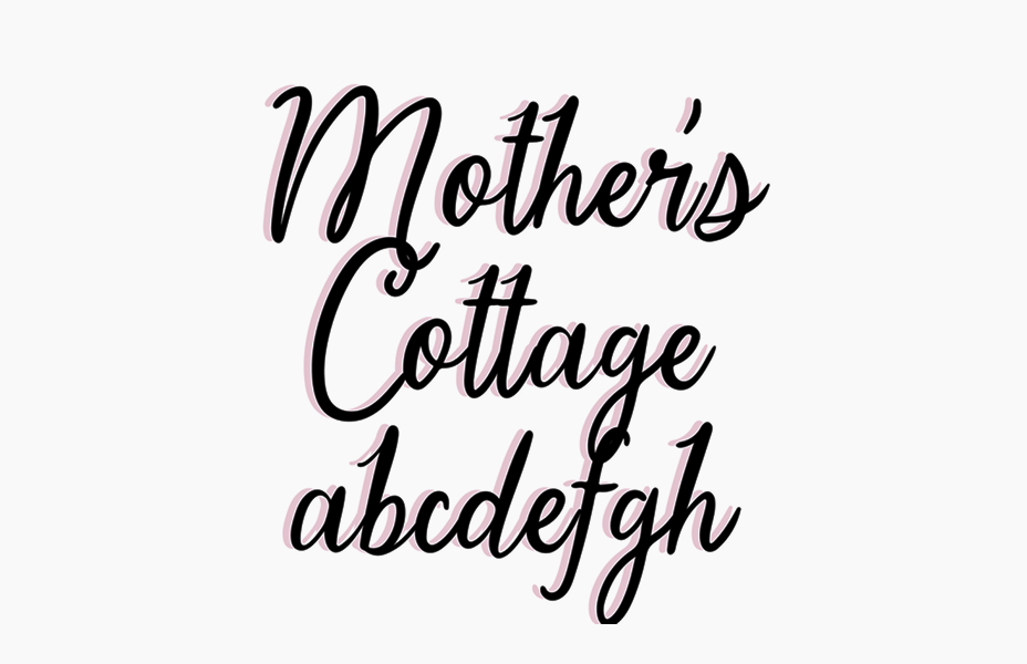
Cursive fonts fall under the script family, but they have one rule. All the letters are connected. Like cursive writing with a pen, letters flow into the next without lifting.
This makes them more like handwritten, personal, and easily read, especially for longer names or messages. Cursive is the way to go if you're looking for something that feels like neat handwriting.
Here’s a tip:
All cursive fonts are script fonts. Not all script fonts are cursive.
Cursive Fonts vs. Script Fonts
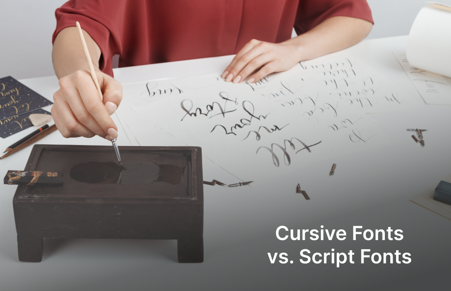
Most people think of script and cursive type as being the same. But there’s one main difference:
- Cursive fonts always have connected letters. They look like traditional handwriting.
- Script fonts may or may not have connected letters. They include both cursive styles and other handwriting-inspired styles.
Here’s a quick comparison between these two
| Feature | Script Font | Cursive Font |
|---|---|---|
| Style | Designed to mimic elegant handwriting with more decorative strokes. | Flowing, connected letters that imitate natural handwriting. |
| Usage | Invitations, branding, logos, decorative headings. | Educational materials, personal notes, casual designs. |
| Readability | May be harder to read in long passages. | Generally easier to read for continuous text. |
| Formality | More formal and decorative. | More casual and approachable. |
This means script fonts offer more styles and choices. This is why they excel in various creative projects.
Why Designers and Creators Love Script Fonts
Script fonts are used everywhere from business logos to handcrafted presents for a reason. Plain text simply cannot match the charm and emotion they bring. Here are some reasons why designers and creators enjoy going back to them, regardless of whether they are entrepreneurs, designers, or hobby crafters.
Emotional Impact
Script fonts put personality behind words. A romantic, elegant script says, “I love you.” A bold brush script exclaims, “Hello, world!” It’s typography that speaks directly to moods.
Brand Storytelling
Your brand’s visual voice can be amplified with the right script font. Handmade brands benefit from casual scripts; luxury brands stand to gain from formal or minimal scripts geared toward sophistication.
Visual Contrast
For body text, use a plain sans serif font, whereas titles should be in a decorative/script font. This combo adds style to your design while keeping it simple. It is excellent for event signs, product packaging, and logos.
Craft-Machine Compatibility
Many of your fonts are labelled “easy handwriting fonts”, designed with Silhouette users in mind. These fonts slice cleanly and weed out easily, making designs spring to life without stress.
How Script Fonts Help Brands Stand Out
Script fonts aren’t just for decoration. They shape how the consumer perceives your product. If you create a logo or packaging, your font can say as much as your name or message.
Example:
A font with soft, rounded lines can create a warm and trustworthy sense in a handmade candle company. A modern, clean script can generate a sense of luxury for a high-end skincare company.
This psychological effect is why many small businesses employ script fonts to provide their products with a handmade, personal touch.
Popular Script Font Styles in 2025
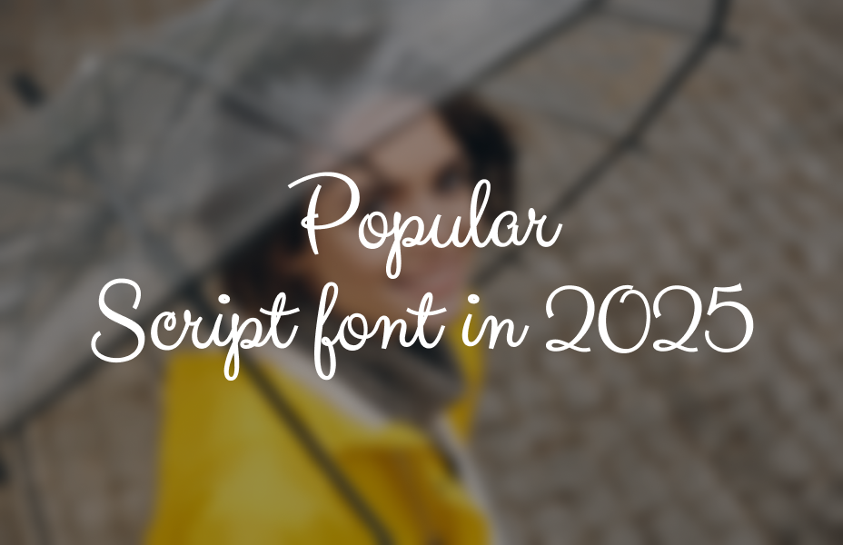
Just like fashion, font styles change over time. In 2025, these script fonts are really popular:
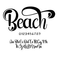
- Bold Brush Scripts:The thick, smooth strokes are created by painting the design with a brush. These fonts shine and draw attention to the title, works, or quotes.
- Modern Calligraphy Script: It's modern and attractive. It's simple without being dull, which requires wit in contemporary design.
- Retro or Vintage Scripts: These fonts suggest retro charm, fostering a lively and warming aura with a product label, shop sign, and all such elements that need a retro representation.
- Handwritten Script: This is the very font that corresponds to somebody's real handwriting. It is somewhat calm and personal and thus works perfectly for a planner, to-do lists, or rapid notes.
How to Select the Right Script Font for Your Project
Using the right font does matter a lot. Here is a quick guide to assist:
- Match the mood. Choose a font that best captures the vibe or energy of your message. If it's anything romantic, use a flowing calligraphy script. For something fun, try a bouncing handwritten one.
- Consider Size: If your design will be small, don't use thin or highly ornate fonts. Opt for one that remains legible even at teeny tiny sizes.
- Check the Cut: Using vinyl or paper, use a script font with smooth, thick lines. It will be easier to cut and weed.
- Pair Wisely: Use a script font for the headline; the rest of the text should be in a clean sans serif.
- Test It First: Always preview the font in your software or with a small print or cut to ensure it functions properly.
Premium Script Fonts vs. Craft Script Fonts: What’s the Difference?
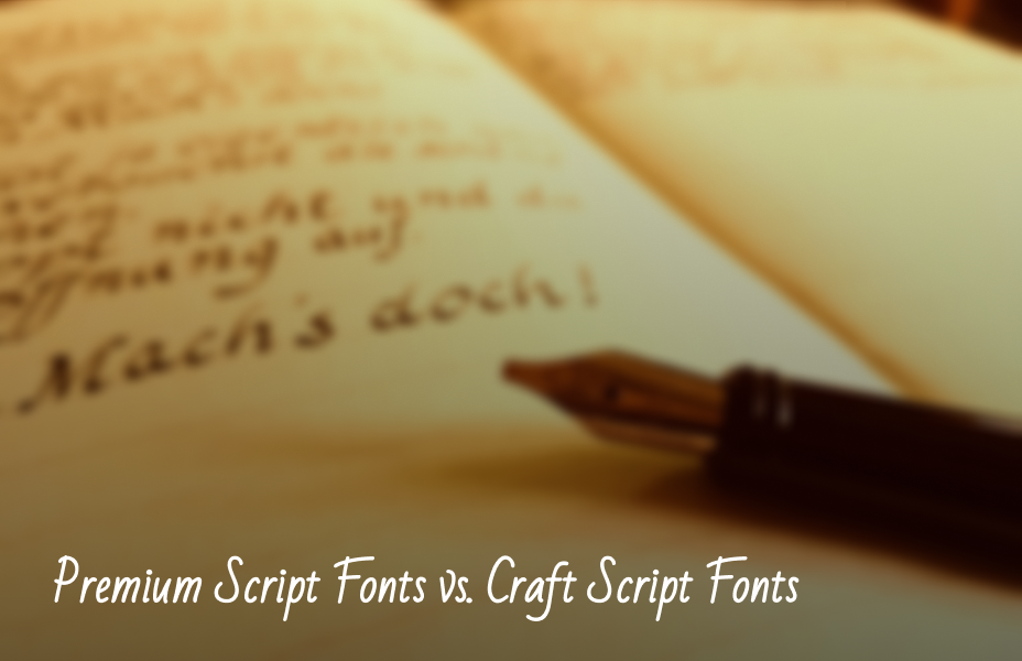
So, when you visit the Fonts section in the Silhouette Design Store, you probably notice we have two different categories for the script font: Premium Script Fonts and Craft Script Fonts.
Their difference is actually quite significant in application. Here's a small guide to assist you in determining what style is right for your design:
Here’s a quick difference guide to help you figure out which style will work best for your design needs:
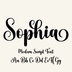
Premium Script Fonts
These fonts are designed with elegance and design detail in mind. They work best in visual projects that don’t need to be cut with a machine.
Best for:
- Invitations and greeting cards.
- Business branding or logos.
- Social media graphics.
- Posters or printables.
- Custom gifts or labels.
Why use Premium Script Fonts?
- They often look more polished and professional.
- Some include special characters or alternate letter styles for extra flair.
- A wonderful way to add a rich and upscale touch to your project!
Perfect when your main goal is to create an attractive piece of on-screen or printed work.
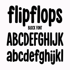
Craft Script Fonts
Craft Script fonts are made to be compatible with cutting machines like Silhouette. They are more straightforward when cutting vinyl, paper, or heat transfer. They are bolder and easier to work with, making them simpler to cut.
Best used on:
- Mugs, tumblers, and drinkware
- T-shirts and tote bags
- Wall decals and home decor signs
Why choose Craft Script Fonts?
- Their shapes are smooth and bold, so they cut cleanly.
- Letters are easy to weed and apply.
- Great option for small-sized designs or projects with intricate cuts.
These fonts are time-saving and help avoid crafting frustration, especially in creating multiple pieces or gifts.
Script Font Pairing Tips for Amazing Designs

Proper pairing of fonts makes your entire design appear more balanced and professional. These are some simple tips to achieve it:
- Balance the script with uncomplicated fonts: An elegant script headline with a neat, easy-to-read body font (such as Montserrat or Open Sans) maintains your message concisely.
- Avoid the use of two script fonts: It will make your design messy and difficult to read.
- Balance moods wisely: Don't match a love script with a tech sans serif font. Maintain an emotional tone with all your fonts.
- Quick Idea: Use your script font for key phrases, names, or headings. Let a simple sans serif handle the rest.
Smart Ways to Use Script Fonts in Real Projects
Here’s how designers and crafters are making the most of script fonts right now:
- Create Eye-Catching Wall Art: Use a bold script for words like “Gather” or “Welcome” to make stunning signs.
- Use Custom Names on Drinkware: Script fonts make a humble mug or tumbler into an individualized gift.
- Sell T-Shirts: Brush or casual script fonts bearing inspirational sayings sell like hotcakes at arts and crafts fairs or online shops.
- Adorn with flairs for Occasions: Use elegant script fonts for wedding signs, birthday backdrops, or shower decor that appears your own.
- Spruce Up Your Planner or Labels: Add fun to everyday organization with crisp, easy-to-read script fonts.
Common Mistakes to Avoid While Using Script Fonts
Script fonts can look pretty, but misusing them can make your design hard to read. Even experienced designers can run into issues with script fonts. Here’s what to watch out for:
- Don’t Use All Capital Letters: Script fonts are meant to look like handwriting. Writing all in capital letters makes the letters awkward and difficult to read.
- Leave Flourishes Minimal: A few curls or swirls are lovely, but many make the text messy.
- Weld Letters Before Cutting: If cutting with a cutting machine, weld the letters together so they will cut as a single piece.
- Use Bold Fonts for Small Text: Thin, fancy script fonts can disappear when they’re small. Pick a thicker style so it stays clear.
Crafting with Script Fonts? Follow These Pro Tips for Perfect Results
If you’re using a cutting machine, a few smart steps can make your project go smoothly:
- Always weld script text so that the letters are all carved out in one seamless shape.
- Use medium or thick fonts for easier weeding and less tearing.
- Test a small cut first to check the quality before preparing your final material.
- Keep designs short and sweet so the text stays readable and impactful.
Let Your Fonts Speak for You
Script fonts are a great tool for any designer or creator. Script fonts express messages with emotion and style. Choosing the right font is crucial in logo design, creating a special gift, or working alongside your Silhouette machine. Knowing the distinguishing factors between cursive and script fonts will allow you to integrate yourself into your work situation smoothly.

Write a Comment
Your email address will not be published